
Sevginur Ak Parlak
Jan 26, 2026
13 min read
Website Information Architecture Design: What I Test First
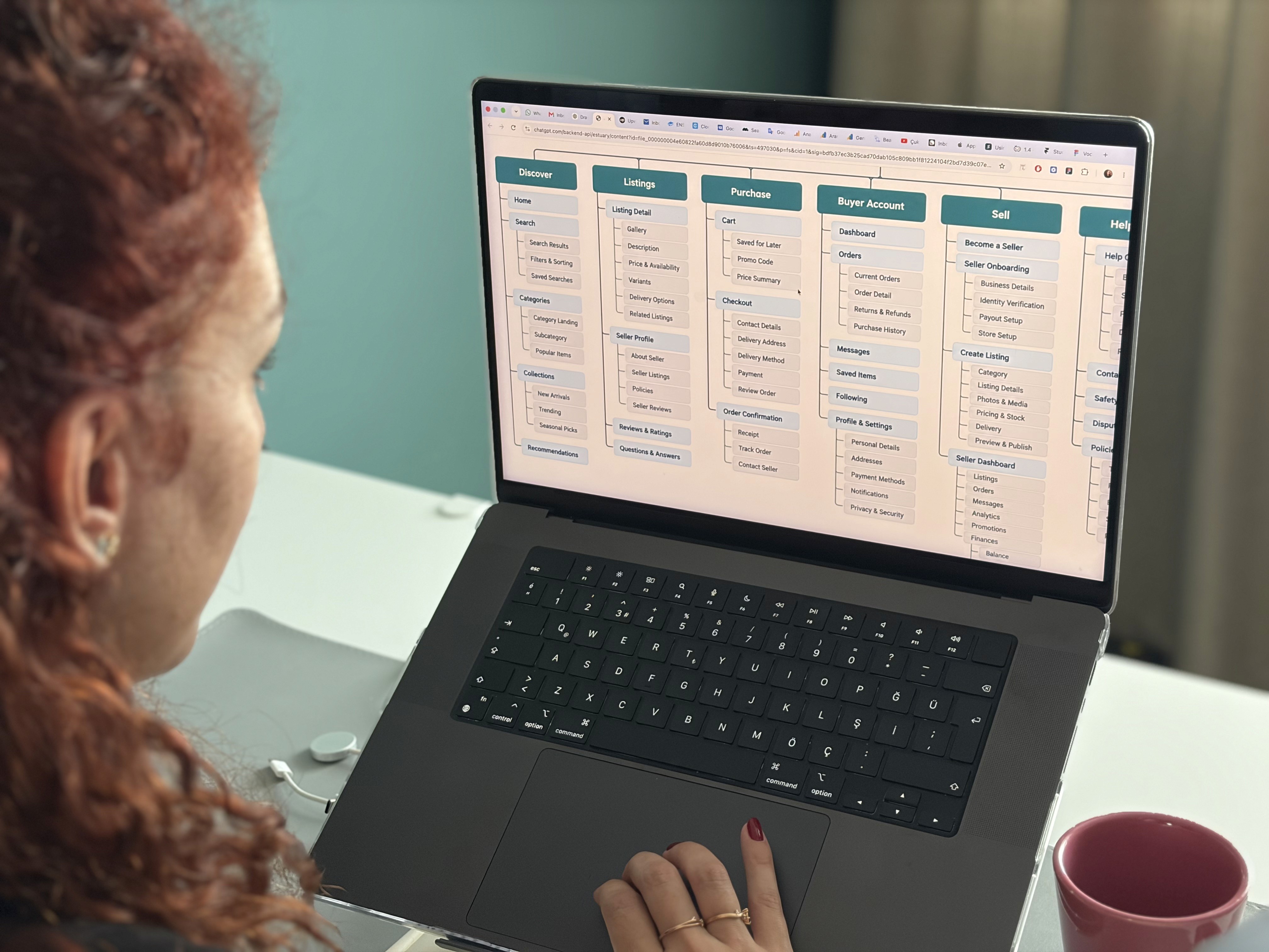
Take a typical case: a shop redesign with 60 finished page designs. Visual design done, a new brand, developers starting the following week. Then a tree test on the new navigation with 25 customers shows that most of them look for returns under "Orders", where it does not exist, and many cannot tell the difference between "Collections" and "Categories". The structure is wrong, and the structure is already painted. I see some version of this in most redesigns that skip structure testing.
That is what website information architecture design exists to prevent. The team knows what the website needs to do. The question is whether the sitemap, the navigation labels, the category structure and the main flows match how visitors think, before visual design and development make it expensive to change.
This post explains what I validate at this stage for marketing sites, ecommerce, marketplaces, booking platforms and content heavy sites, how I use low fidelity page wireframes and a clickable wireframe, how tree testing and 5 usability sessions fit together, what the validation report contains, and how much usually changes.
Why structure fails more expensively than visuals
A visual problem is local and costs hours. A structural problem is global. If "Pricing" sits under "Resources" instead of in the main navigation, every page that links to it, every footer, every breadcrumb, every internal search result and every URL is affected. If a category structure is wrong on an ecommerce site, the product data, the filters and the SEO landing pages are all wrong with it. As a rule of thumb, a structural change after development starts costs 5 to 10 times what the same change costs in a sitemap.
The other problem is that structure is invisible to the team. After a few years of running the company, the founders see the map in their head, not the website. Visitors arrive from Google on a page in the middle of the site with 5 seconds to understand where they are. The only way to find where the 2 maps differ is to test with people who have never seen the site.
What I validate in website information architecture design
I do not test the whole website. I test 6 things, in this order.
Sitemap
The complete list of pages and how they nest. For a marketing site this is 15 to 40 pages, for a shop or a marketplace it is 8 to 15 page templates and a category tree. I check that every page has 1 clear job, that nothing important is more than 3 clicks from the home page, and that the grouping matches how visitors describe what they want.
Navigation labels
The words in the main menu, the footer and the category names. Labels usually come from the company's internal vocabulary. "Solutions" means something to the sales team and nothing to a visitor. Tree testing is built to catch this.
Content hierarchy and page templates
What goes first on each template, what is secondary, what can be cut. I validate the order with wireframes, because the order is the structure of the page.
Search and category structure
On a content heavy site or a large shop, more than 30 percent of visitors go to search or filters before they touch the menu. I check whether the filters use the same words as the categories and how results are grouped.
Mobile navigation
On most consumer sites, more than half of the visits are on a phone. A navigation with 8 top level items and 3 levels of dropdowns does not survive a phone. I test the mobile menu as a separate structure, because it usually needs to be one.
Checkout or booking flow
For ecommerce, marketplaces and booking platforms, 1 flow carries the revenue. I map it step by step and test whether the order of steps matches the order in which visitors have the information. A booking flow that asks for an account before it shows availability will lose people.
Low fidelity page wireframes vs a clickable wireframe
Low fidelity page wireframes are grey boxes with real labels, 1 per template. I use them in week 1 to settle the sitemap and the content hierarchy with the team, because nobody argues about a shade of blue when there is no blue.
A clickable wireframe is the same templates with real navigation and real labels, linked together in Figma in a desktop and a mobile version. Still greyscale, but a visitor can try to find a product, compare 2 plans or complete a booking in it. You cannot watch someone get lost in a static page. It covers the 3 to 5 journeys we are validating, usually 15 to 30 screens, not every page.
I avoid high fidelity at this stage. As soon as a wireframe looks finished, participants comment on the photos and the fonts and the team stops changing the structure.
Tree testing with 15 to 30 participants and 5 moderated sessions
Tree testing checks the sitemap without any interface. I put the proposed navigation into a text only tree and ask 15 to 30 people where they would go for 8 to 10 tasks, like "find out if this jacket can be returned" or "book a table for 6 on Saturday". It is remote and unmoderated and takes 4 to 5 days in total. It tells me which labels and groupings fail, at a scale that 5 sessions cannot.
Then I run 5 moderated usability sessions on the clickable wireframe, 45 minutes each, with people who match the target visitor. 3 of the 5 use the mobile version. I give them 4 to 6 tasks and I stay quiet. 5 sessions find the majority of structural problems. The 6th session mostly repeats what the first 5 showed. If the site has 2 audiences, like buyers and sellers on a marketplace, I run 5 sessions for each.
What the validation report contains
It starts with the revised sitemap: the page list, the navigation tree for desktop and mobile, and the labels, with a note next to each change saying which test result caused it. Then the revised templates and the revised checkout or booking flow with the changed steps marked.
Then the findings. Each has evidence, meaning a session clip or a tree test result, a severity rating, and what we changed in the wireframe because of it.
And the updated clickable wireframe in Figma, ready to be the base for visual design. If another team does the visual design and the dev ready Figma, these 2 files are enough for them to start. We wrote about what dev ready means in design handoff to developers.
How much changes after testing
In a typical validation, expect the structure of 20 to 40 percent of the pages to change. Usually 2 or 3 labels in the main navigation, 1 category that is split or merged, 1 flow with steps in the wrong order, and 3 to 5 page templates where the content order moves. The rest survives, and now the team knows why.
In wireframes that is 3 to 4 days of work. After visual design it is 2 weeks. After development it is a quarter of content migration and redirects, and by then the team usually decides to live with it. The product design process for an early stage startup we describe puts structure before visuals, and the same applies to a website.
A first pass you can do yourself in 1 afternoon
Export your current sitemap from your CMS or analytics, and list the 20 pages that get 80 percent of the traffic.
Ask 3 people outside the company to sort those 20 page titles into groups and name the groups. Compare their names to your menu.
Write your checkout or booking flow as a numbered list of steps. Next to each step, write what the visitor needs to know at that step and where they got it.
Open your site on a phone and try to reach your most important page from the home page. Count the taps.
Read the 50 most recent site search queries. Every query that matches a menu item is a label that visitors did not find.
Give 2 people 3 tasks on the current site and stay quiet for 10 minutes. Write down every place they hesitate.
If step 2 gives you 3 different structures, or step 6 produces more than 5 hesitations, you have a structural problem and a new visual design will not fix it.
Where AI tools help and where they do not
AI tools are useful for the mechanical part. I use them to draft a sitemap from a content inventory, to write 10 variants of a navigation label, and to transcribe and summarise 5 hours of session recordings in 20 minutes.
What they cannot do is tell you whether your structure matches your visitors. An AI will produce a plausible sitemap for any kind of website, because it is an average of every website it has seen. Your visitors are not average. They have their own vocabulary and habits that only appear when you watch a person try a task and fail. The tree test and the 5 sessions are still where the decisions get made.
Mistakes I see in website structure and navigation testing
Testing the visual design instead of the structure. A high fidelity mockup gets feedback about photos and fonts. The team fixes the photos and ships the wrong navigation.
Testing with the team. Your colleagues know where everything is. 5 sessions with internal people produce 0 structural findings and a false sense of confidence.
Testing only on desktop. The team reviews on a 27 inch monitor and most visitors arrive on a phone.
Leading the participant. "Would you click Solutions to find pricing?" is not a task. "Find out what this costs for a team of 10" is a task. Then silence.
Treating the result as an opinion. If 15 of 25 participants looked for returns under Orders, returns go under Orders. It is not a matter of taste anymore.
Skipping the test because the launch date is close. The test takes 2 weeks. Fixing the structure after launch takes a quarter of redirects and lost rankings.
FAQ
What is website information architecture design?
It is deciding how the pages of a website are organised, what they are called, how the navigation and categories are structured, and in what order content appears on each page template. Done properly it is tested with visitors on a sitemap and a clickable wireframe before visual design and development. It takes 2 to 3 weeks and includes tree testing and 5 moderated sessions.
How many participants do I need for tree testing?
15 to 30 for a single audience. Below 15 the results are noisy, and above 30 the picture rarely changes. For the moderated sessions on the clickable wireframe, 5 per audience find the majority of structural problems, and the 6th mostly repeats what the first 5 showed.
Should I test wireframes or the finished design?
Test the wireframes. A greyscale clickable wireframe keeps feedback on the structure, the labels and the flow. A finished design gets feedback on photos and fonts, and the structural findings get lost in it.
How long does sitemap and wireframe testing before web development take?
2 to 3 weeks for 1 audience. Week 1 covers the content inventory, sitemap, tree test and page wireframes. Week 2 covers the clickable wireframe in desktop and mobile, 5 moderated sessions and the validation report. A sitemap and tree test alone takes 1 week.
How much changes after testing a website structure?
Typically the structure of 20 to 40% of the pages changes. Typically 2 or 3 navigation labels, 1 category split or merged, 1 flow with steps in the wrong order and 3 to 5 templates where the content order moves. In wireframes that is 3 to 4 days of work.
Working with us
We run website information architecture design and testing for marketing sites, ecommerce, marketplaces, booking platforms and content heavy sites in 2 to 3 weeks. Week 1 is the content inventory, sitemap, tree test and page wireframes. Week 2 is the clickable wireframe in desktop and mobile and 5 sessions. You get the revised sitemap and wireframe in Figma, a validation report with evidence for every change, and a 3 minute cut of the sessions, because founders act on a video of a real customer failing to find the pricing page.
We also say when you do not need this. If your website is 6 pages with 1 audience, run the first pass above and a tree test yourself and spend the budget on the content. If the site is live and the problem is conversion on 1 page, a UX audit of that page will teach you more.
If you are planning a new website or a large redesign and you are not sure the structure is right, that is what this is for. Book a free 15 minute intro call and show us the sitemap. We will tell you what we would test first, even if you run the sessions yourself.
