
Sevginur Ak Parlak
Feb 2, 2026
12 min read
Marketplace product design: how to design a 2 sided marketplace MVP
Take a typical case: a deck for a booking platform for private chefs. It has 3 user roles, 48 screens, and a chat. Ask how many chefs have agreed to be listed, and the answer is 0. Ask how a guest would find the first chef, and the answer is search. Search over 0 chefs is an empty state, not a product.
That is the problem with marketplace product design. A marketplace is 2 products that only work together, and most decks design the demand side because it is the fun side. In this post I explain how we run product discovery for a 2 sided marketplace or booking platform: which side to design first, how to find the core loop, why trust and payment states are most of the design, and how a scope cut takes 48 screens to 12.
This is the marketplace version of our product discovery for startups sprint. The structure is the same, 1 to 2 weeks, but a marketplace has 2 sides, 2 empty states, and 1 transaction that both sides must trust.
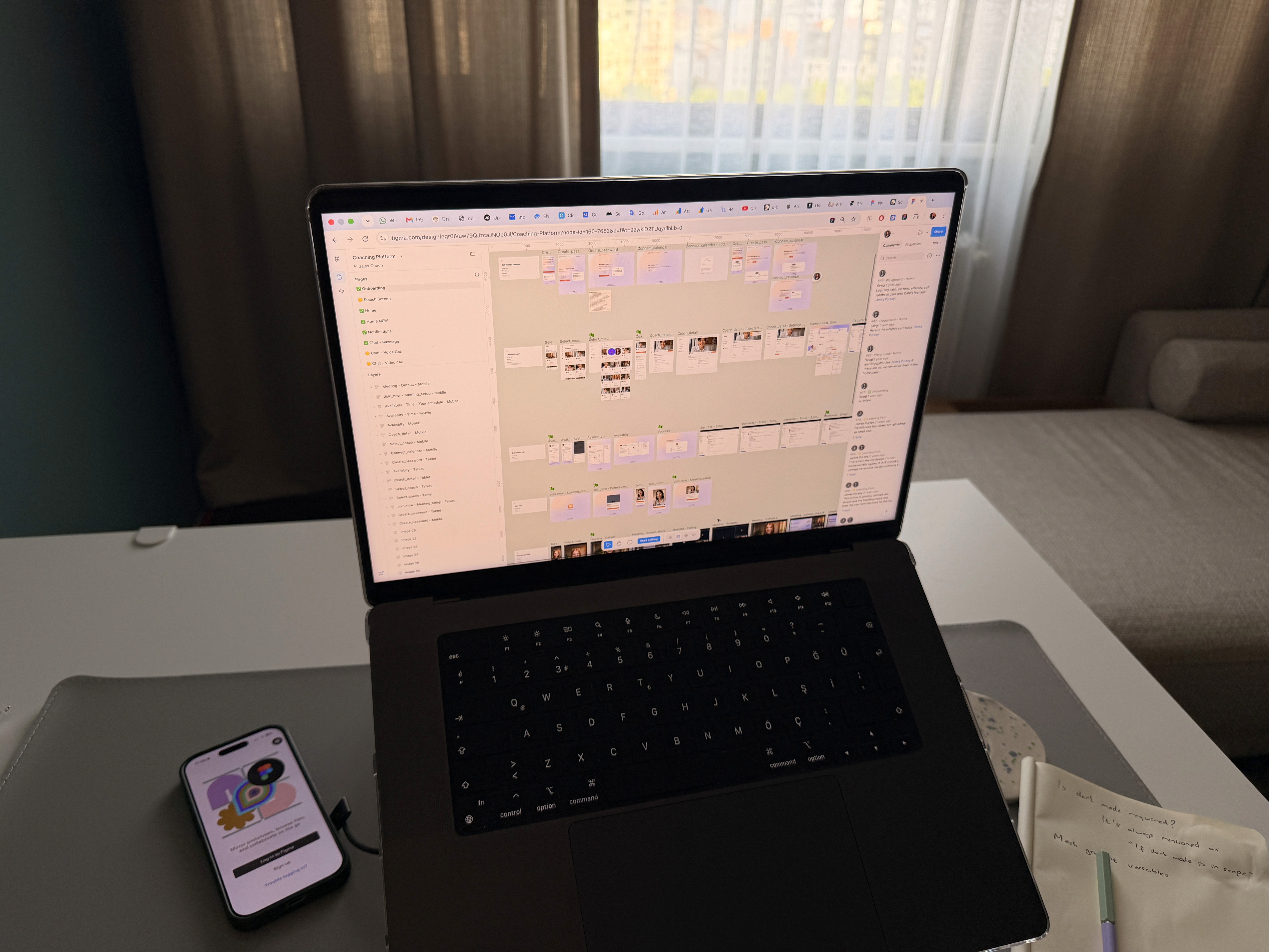
What marketplace product design has to solve first
A normal product has 1 user, 1 core job, and 1 empty state. A marketplace has a supply side that lists, a demand side that books, and a transaction in the middle. Each side has its own job, its own empty state, and its own reason to leave. The product only works when both sides show up at the same time in the same place.
So the first question in marketplace product design is not what the app looks like. It is which side is harder to get, and what the product must do for that side on day 1 with the other side at 0. For most booking platforms the hard side is supply. Chefs, tutors, cleaners, and clinics already have customers. They do not need a platform. Guests do not need a platform either if there are 0 chefs on it.
The second question is what the transaction is. Not "book a chef", but the exact moment money moves, what each side sees at that moment, and what happens when it goes wrong. That moment and its states are 60 percent of the screens in a booking MVP, and 0 percent of most decks.
Which side to design first
We design the supply side first in most cases, and we design it small. The supplier needs 1 thing from the product in week 1: a listing that gets them a booking they would not have had otherwise. That means a profile they can create in 5 minutes, an availability editor they will use, and a request they can accept from their phone in 2 taps.
The demand side comes second, and it starts with the empty state. The first 50 guests will see 8 chefs, not 800. Search and filters make sense at 800. At 8, the right demand side is a list, a good profile page, and a request button. We design for the number of suppliers the founder can recruit in 60 days, not for the number in the deck.
There are exceptions. If the founder already has 200 suppliers from a previous business, demand is the hard side and we design it first. If supply is public data, like clinics with public hours, the product can start with imported listings. The day 1 question decides this, and the answer changes the whole information architecture.
Finding the core loop of a booking platform
The core loop is the sequence that, when it completes, both sides come back. For a booking platform it has 6 steps. The supplier lists. The guest finds and requests. The supplier accepts. Payment is held. The service happens. Both sides rate and the guest rebooks. If any 1 step breaks, the loop does not repeat and the marketplace does not grow.
In discovery I draw this loop as 1 user flow across both sides, with the handoffs marked. Every handoff is a place where 1 side waits for the other, and waiting is where drop off happens. A request that waits 2 days for an accept is a lost guest. So the flow includes the waiting states: what the guest sees while waiting, what the supplier gets as a notification, and what happens at hour 24 if nobody answered.
The prototype covers this loop only, both sides, 10 to 14 greyscale screens in Figma. We test it with 3 suppliers and 3 guests, each side playing their part on the same booking. Watching a real chef read a request from a stranger tells us more than 20 screens of visual design.
Trust and payment states are most of the design
Founders count screens by feature: search, profile, booking, chat, payment. We count screens by state, and the states are where a marketplace is designed. A booking has at least 9 states: requested, accepted, declined, expired, paid, in progress, completed, cancelled by guest, cancelled by supplier. Each state needs a screen or a message on both sides. That is 18 views before a single feature.
Trust is built in those states. The guest wants to know the supplier is real, the money is safe until the service happens, and what happens if the chef does not show up. The supplier wants to know the guest will pay, the address is real, and what happens if the guest cancels 1 hour before. The design answers each of those questions at the moment the user asks it, not in a help centre.
Payment states are the most skipped. Held, released, refunded, partially refunded, and payout pending are 5 states the guest and supplier will each ask support about in week 1 if they are not on screen. We design them in discovery, in greyscale, because they decide the payment provider and the data model before a developer starts.
The scope cut for a marketplace MVP
The scope cut follows the same 3 columns as our general discovery: build now, build after the first 50 bookings, do not build. The rule is the same: if 1 booking can complete without it, it is not build now. But a marketplace cut has 2 extra rules.
Rule 1: nothing that needs scale goes in build now. Search, filters, ranking, recommendations, and reviews sorted by rating all need hundreds of listings and bookings to work. At 8 suppliers they are noise. A list sorted by availability is the MVP search.
Rule 2: nothing that replaces a phone call goes in build now unless the phone call is failing. In app chat is the first feature every founder wants and the last 1 the first 50 bookings need. The request itself is the message. If both sides need to talk before booking, we learn that in the usability test and design the 1 question they ask, not a chat.
In the chef example, 48 screens become 12 build now: 4 for the supplier, 6 for the guest, and 2 shared for the booking states. The supplier side can ship first and recruit the first 10 chefs while the guest side is still in design.
A first pass you can do yourself in 1 evening
Before you brief a marketplace design studio, do this. It takes 2 hours.
Name the 2 sides in 1 word each. Write what each side does today without your platform.
Write which side is harder to get, and how many of them you can personally sign in 60 days. That number sets the demand side design.
Write the core loop in 6 steps, from listing to repeat booking. Mark every step where 1 side waits for the other.
List every state a booking can be in. Aim for 9 or more. For each, write 1 line for what each side sees.
Take your feature list and remove everything that needs more than 50 listings to work. Count what is left.
Ask 3 suppliers if they would accept a request from a stranger through your product this month. Count the yes answers.
If step 2 returns under 10 and step 6 returns 0, the supply side is the product, and the guest side can wait.
Mistakes I see in marketplace product design
Designing the demand side first because it is the pretty side. The guest app with search, map, and filters gets built, and it opens on an empty state because supply was never designed.
Treating both sides as 1 user. A supplier and a guest have different devices, different moments, and different fears. 1 onboarding for both means neither is right.
Skipping the booking states. 5 feature screens and 0 state screens means every cancellation goes to support by email in week 1.
Building chat before the request works. Chat hides a broken request flow behind a conversation, and now the design cannot see where the loop breaks.
Designing for 800 listings. Search, filters, and ranking at 8 listings tell the guest the platform is empty. A list tells them there are 8 good chefs.
Where AI tools help and where they do not
AI tools help with the volume of a 2 sided product. Drafting 18 state messages from a table of 9 states takes 20 minutes. Generating the supplier profile copy from 5 real chef interviews is fast. Summarising 200 reviews of 3 competing platforms into supply side and demand side complaints is fast.
They do not help with the day 1 question. An AI tool will design a search page for 800 chefs without asking how many chefs exist. It will not notice that every supplier in the test hesitated before entering their address. And it will not tell the founder the demand app should wait 5 weeks. Which side, which loop, and which 12 screens are judgement.
FAQ
What is marketplace product design?
It is the design of a product with 2 user sides, supply and demand, and a transaction between them. It differs from single user product design because there are 2 core jobs, 2 empty states, and a set of booking and payment states that both sides must trust. The design starts with which side is harder to get.
How do I design a 2 sided marketplace MVP?
Decide which side is harder to get, design that side first and small, then design the demand side for the number of listings you can recruit in 60 days. Draw the core loop across both sides, design every booking and payment state before any feature, and cut everything that needs scale to work. The result is usually 10 to 14 screens.
Which side of a marketplace should I build first?
Usually supply, because suppliers already have customers and need a reason to list, while demand needs listings to exist. If you already have hundreds of suppliers or supply is public data, start with demand. The answer comes from how many of the hard side you can personally sign in 60 days.
How long does product discovery for a booking platform take?
2 weeks in most cases. Week 1 covers the 2 sides, the day 1 question, the core loop, and the scope cut. Week 2 covers the greyscale prototype of both sides and a usability test with 3 suppliers and 3 guests on the same booking. MVP design follows in 4 to 6 weeks.
What states does a booking flow need?
At least 9: requested, accepted, declined, expired, paid, in progress, completed, cancelled by guest, cancelled by supplier. Plus 5 payment states: held, released, refunded, partially refunded, payout pending. Each needs a view on both sides.
Do I need in app chat in a marketplace MVP?
Not in the first 50 bookings. The request itself is the message. If the usability test shows both sides need to ask 1 question before booking, design that 1 question into the request. Chat before the request works hides where the loop breaks.
Working with us
We run marketplace product design as a 2 week discovery: the 2 sides and the day 1 question, the core loop across both, the booking and payment states, and a scope cut, then a greyscale prototype of both sides tested with 3 suppliers and 3 guests. If the recommendation is build, MVP design of 15 to 25 dev ready screens follows in 4 to 6 weeks, supply side first, with the first screens in 5 business days. We work in Figma, Claude, Slack, and Loom, async across timezones. For an app first idea without 2 sides, see our post on how to validate a mobile app idea.
We also say when you do not need us. If your marketplace already has 500 bookings a month and the question is why suppliers stop answering requests, you need a UX audit of the supplier flow, not discovery. If you have 0 suppliers signed and no plan to sign 10, the work this month is recruiting, not design. We will say that on the intro call.
If you have a booking platform deck with 3 roles and 48 screens, send it to us. We will tell you which side to start with. Book a free 15 minute intro call
