
Sevginur Ak Parlak
Oct 2, 2025
6 min read
Onboarding for SaaS: Understanding the Current Journey
Before redesigning a SaaS onboarding flow, I audit the journey users already experience. For this client, I needed to understand who users were, what they expected, and where the product was losing momentum:
Who are they?
What are they looking for?
How many campaigns do they run per year?
How many people work in their company?
This case study explains how I mapped the existing journey, combined behavioral data with manual review, and prioritized the friction most likely to block activation.
Analyzing the Current Journey
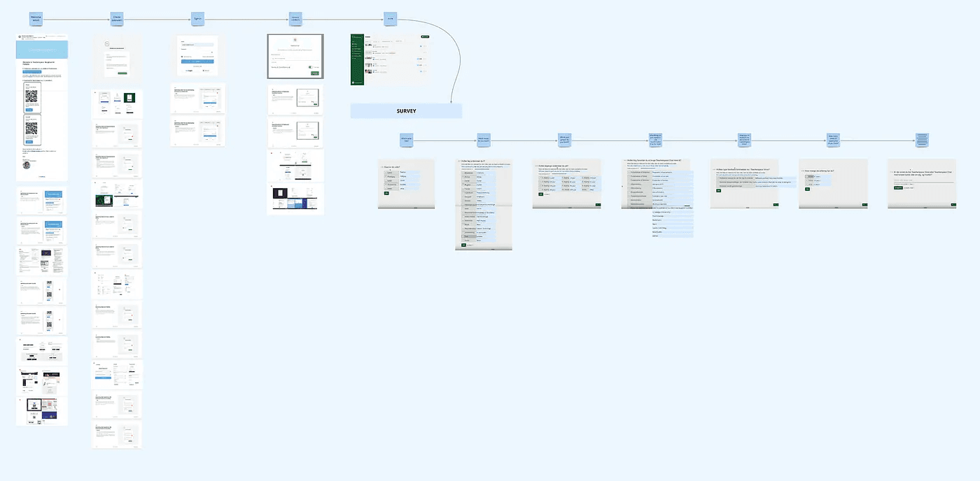
To improve the onboarding experience, we first need to fully understand the current process. This means examining every step and identifying where users might face challenges.
Here’s what that process looks like:
Testing across devices (desktop, tablet, mobile).
Using different types of email accounts (Gmail, work email).
Trying various ways to answer forms (filling in all fields vs. skipping some).
Engaging with different support options (email, chatbot, customer service).
Creating a customer journey map can help visualize every touchpoint: screens, notifications, emails, and SMS (if applicable).
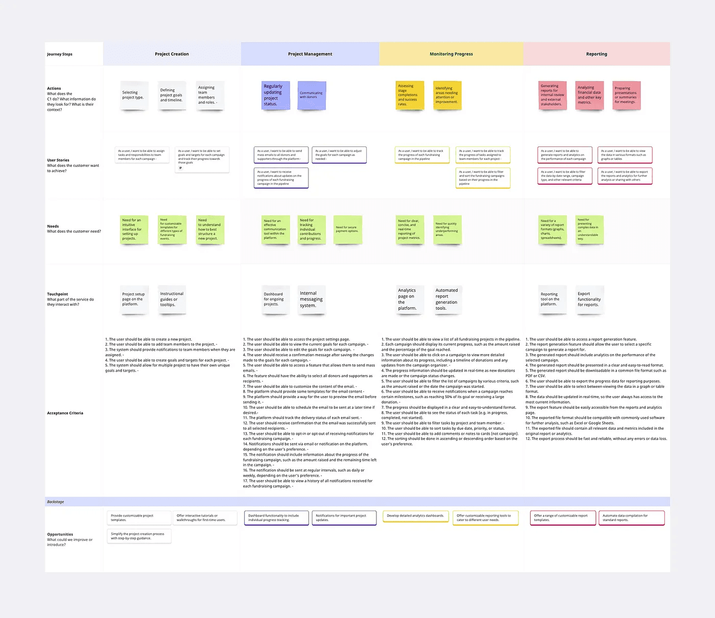
If time and budget allow, conducting a mini usability test with 5–8 participants can reveal how users experience the onboarding.
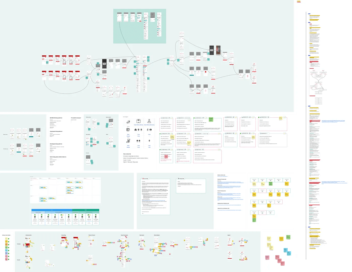
Unfortunately, for this project, we didn’t have the resources for a usability test.
Understanding user behavior can be challenging without data. Relying solely on observations or usability tests might miss hidden pain points or patterns in user drop-offs.
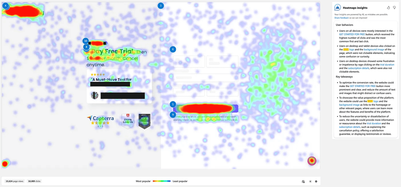
Analytics tools can provide valuable insights by tracking how users interact with each step of the onboarding process. Conversion rates, heat maps, and session recordings reveal which areas users struggle with or abandon. Additionally, some AI-powered tools can highlight key friction points and suggest optimizations.
The Current User Flow
The onboarding flow on my client’s platform was quite simple:
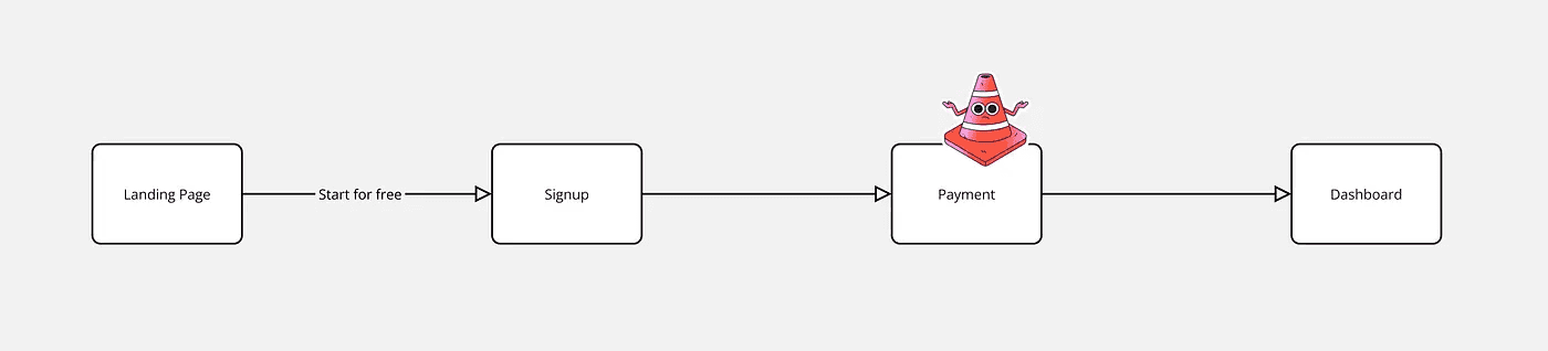
Sign-Up/Sign-In: Users are asked to create an account or sign in.
Payment Page: Right after sign-up, users are directed to the payment page.
Dashboard: After payment, users land on the dashboard with no guidance.
While simplicity can be beneficial, it often leaves users feeling lost and unsure of the product’s value.
Here are the 4 key issues that I identified on this journey:
Clarifying Product Value
Users encounter a payment page immediately after sign-up, without seeing the product or understanding its value. This leads to a high drop-off rate, as users are hesitant to pay for something they haven’t experienced.
If the product’s value isn’t communicated clearly by the time users reach the payment page, they’ll be reluctant to enter their payment information, even with a free trial. People need to feel confident that the product is worth their time and money before committing.

My thoughts on this issue:
The ideal solution is to let users explore the platform or try a few features before asking for payment. Even if a full trial isn’t possible, showing key screens or offering a guided preview can give users a sense of the product’s value.
Challenges with Upfront Payment
Many users cancel free trials on day one to avoid an unexpected charge. On this platform, cancelling immediately deleted the account, but that consequence was not communicated clearly enough.
I discovered this after cancelling my own trial. The warning existed, but it was buried in copy that was easy to scan past. Important consequences should not depend on users reading every line: the interface should explain them clearly at the decision point.

My output from this experience:
The cancellation journey needs to be considered as part of the onboarding redesign. Clear communication about what happens when a subscription is canceled is essential. Users should understand the implications without needing to read through lengthy disclaimers.
User Confusion and Frustration

Once users complete payment, they’re left to navigate the platform on their own, with no onboarding guidance. This can lead to confusion, especially in a complex SaaS product.
Without a clear starting point or instructions, users may feel overwhelmed and unsure of how to use the product effectively. SaaS products often solve niche problems, so newcomers need guidance to understand their value and functionality.
Guidance does not have to mean a long sequence of coach marks. Useful empty states, sample data, contextual prompts and a clear first task can help users move forward without interrupting them.
The product served three distinct user groups, but its starting experience prioritized only one feature. Without a useful home or dashboard, users in the other groups could miss the part of the product most relevant to them.
Design decision:
Lead each user group toward the feature that delivers its earliest meaningful result. A role-aware dashboard can highlight the right next action while keeping the overall product structure consistent.
Lack of Personalization

The current onboarding process treats all users the same, despite their varying needs and goals. This one-size-fits-all approach feels impersonal and limits engagement.
The platform’s users range from freelancers to large agencies, each with unique expectations. If onboarding doesn’t adapt to these differences, it risks disengaging users by failing to meet their specific needs.
Design decision:
Ask only the questions that will change the experience. If an answer will not affect recommendations, setup or the first task, postpone the question until it becomes useful.
Every extra question delays the user from trying the product and raises expectations of personalization. A long intake followed by a generic experience feels disappointing. Keep the initial setup focused, explain why information is needed, and use every answer visibly.
A useful onboarding redesign starts with evidence: map the current journey, identify the activation moment, then prioritize the few changes most likely to help users reach value sooner.
Use the checklist below as a practical first pass before adding new onboarding screens or patterns.
SaaS onboarding UX audit checklist
Review these points in order. Problems near the beginning of the journey usually make every later step look worse.
Define the activation moment in one measurable sentence.
Count every required step between sign-up and that moment.
Check whether users see product value before payment is requested.
Review empty states for a clear next action, example and reason to continue.
Test the flow on mobile, desktop and with realistic account states.
Use funnel data, session recordings and support themes to locate friction.
Remove questions whose answers do not change the immediate experience.
Prioritize fixes by user impact, frequency and implementation effort.
Continue with the complete SaaS UX audit guide, see how I approach a SaaS product redesign, or review product design pricing.
