
Sevginur Ak Parlak
Jul 24, 2026
6 min read
I Let AI Design My App. Then I Did It Properly.
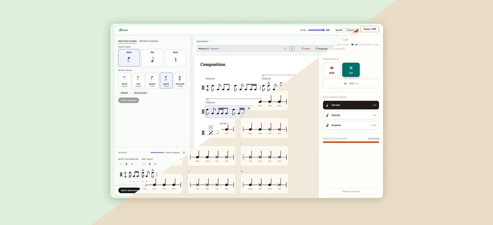
I keep hearing the same thing over and over:
“AI is going to take the designer’s job.”
And I get why people say it. At first glance, AI looks like it’s doing design. You type a sentence, you get a polished screen back in seconds. It feels like magic, and if you squint, it feels like the end of a profession.
But I’ve been building with these tools long enough to know that’s not what’s happening. AI is a tool, a genuinely powerful one. And the clearest way I can explain the difference between “a tool that does design” and “a tool that helps you design” is to just show you two screens from the same project.
I was building a percussion notation editor, an app for writing rhythms for frame drums, the Bendir and the Erbane. The important part: you write patterns out of a few basic strokes. Düm, Tek, and Rest. Beginners need to hear the rhythm to learn it.
Attempt 1: I wrote a prompt.
I described what I wanted and asked Claude design to design it. I even attached a reference document explaining how the notation works, what the strokes are, how they should be written. A few seconds later, I had Design A.
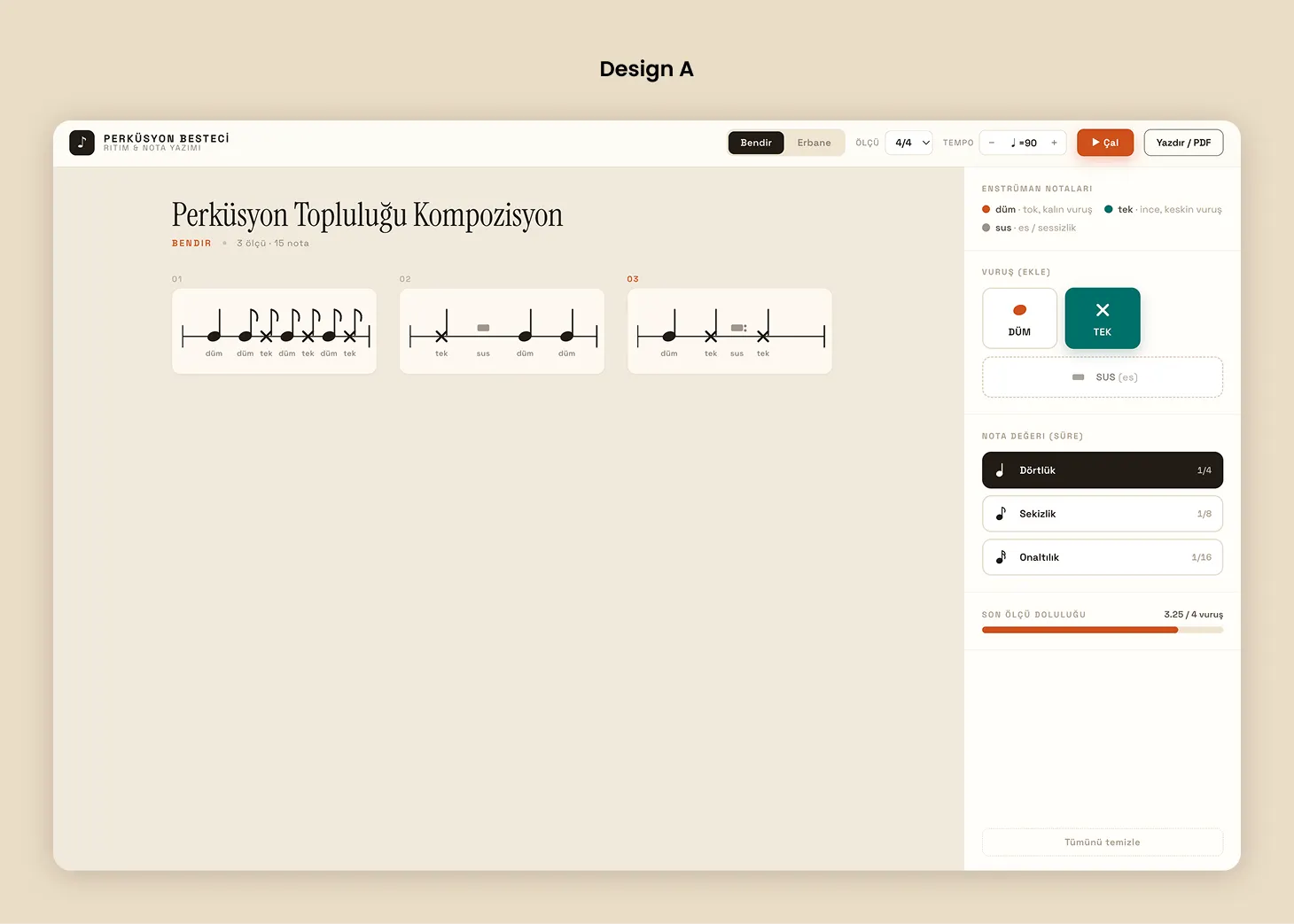
And I want to be fair to it, because this matters: it’s not that ugly. It’s actually clean and warm (when you compare it with current notation tools in the marketplace). There’s a tempo control, a play button, a print and PDF export. It looks like a decent tool.
That’s exactly why it’s the interesting example, because the problem isn’t on the surface. The problem is what happens when you try to use it.
On the right, you get a stack of panels: an “add a stroke” picker, a note value picker, a fill meter. Everything’s present, and nothing’s sequenced. It never tells you: pick a stroke first, then a duration, then commit, here’s the button. There’s no starting point for a newcomer. No template to riff off. No preview of the beat you’re about to place before it lands in the bar. Meter is a bare 4/4 dropdown you’re just expected to understand.
It gave me every ingredient, plated nicely, and no recipe.
And I’ll mention this only in passing, because it deserves its own post: it also quietly rewrote the note structure. I had handed it a document explaining exactly how these strokes should be notated, and it ignored it, drew its own note shapes, rendered the rest as a little block instead of a real rest symbol. So it’s not just under built but in places it’s plainly wrong, in a way the reference I gave it should have prevented. A prompt doesn’t guarantee the model actually honored your constraints. You still have to check.
That’s the ceiling of a prompt. A prompt describes what you want. It has a much harder time deciding what matters most and in what order, and, apparently, a hard time even respecting the spec you handed it, because none of that lives in a feature list. It lives in your understanding of the person on the other side of the screen, and your willingness to verify the output.
Attempt 2: I did the actual work.
So I closed the magic button approach and did what I’m actually trained to do.
I thought about who may use this and why. I wrote user stories, mapped the flow: the very first thing someone does, then the second, then what can wait. I asked what the first ten seconds should feel like for someone who has never notated a rhythm in their life. I asked what to hide, which is almost always the harder and more important question than what to show.
Then I turned all of that into a wireframe. And then I handed the wireframe to the AI.
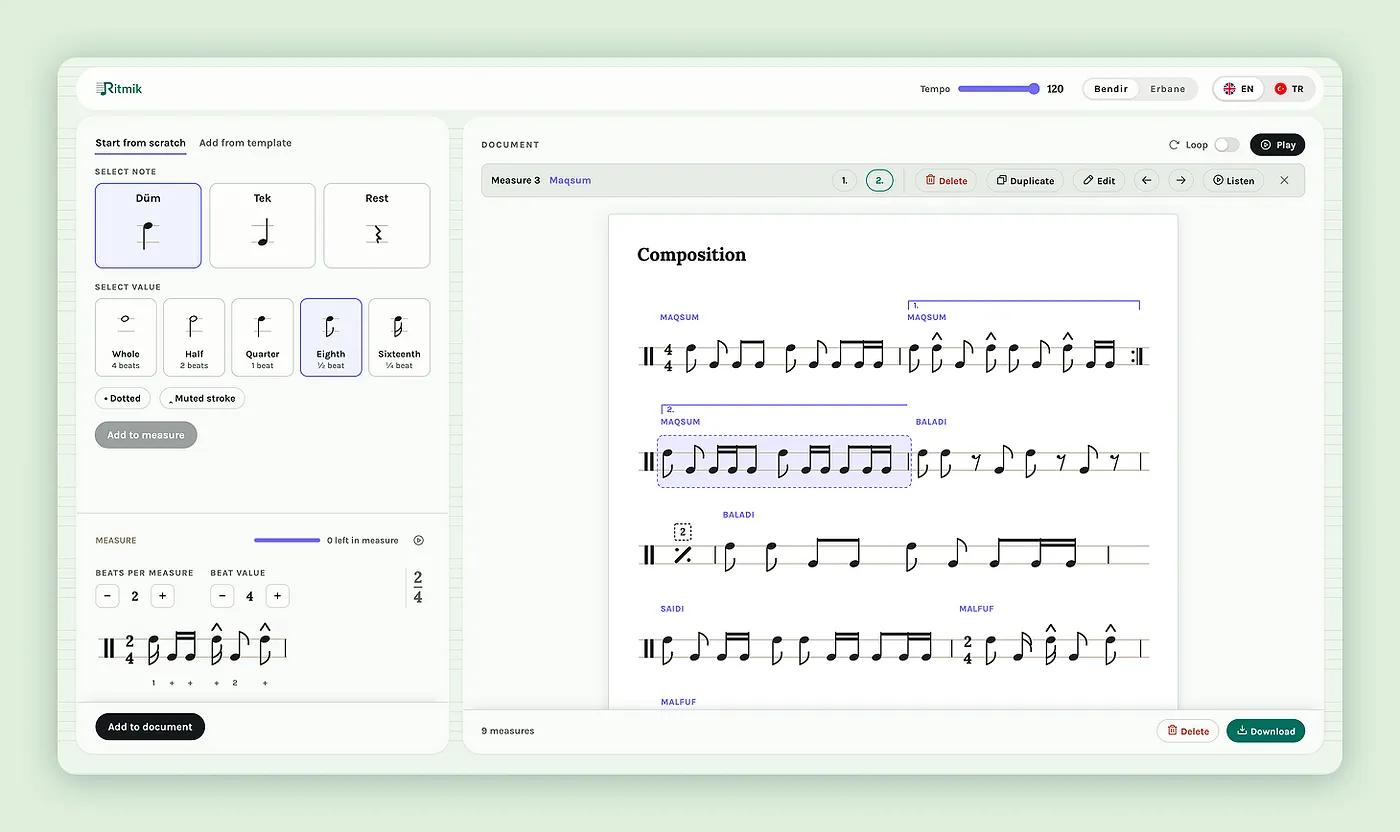
The result was Design B, and the experience is a completely different thing.

Now there’s an actual path. Pick a stroke, pick a value, then a clear “Add to measure.” You always know your next move. There’s a “Start from scratch” and an “Add from template” split, so a nervous beginner gets a door to walk through.

There’s a live preview of the single beat you’re building before you commit it. Meter is set with plain plus and minus steppers labelled “beats per measure” and “beat value,” not a dropdown you have to decode. And the nuance, like dotted notes, muted strokes, and a loop for practicing a bar over and over, only surfaces when it’s actually relevant, so it never crowds the person who just wants to tap out a beat.
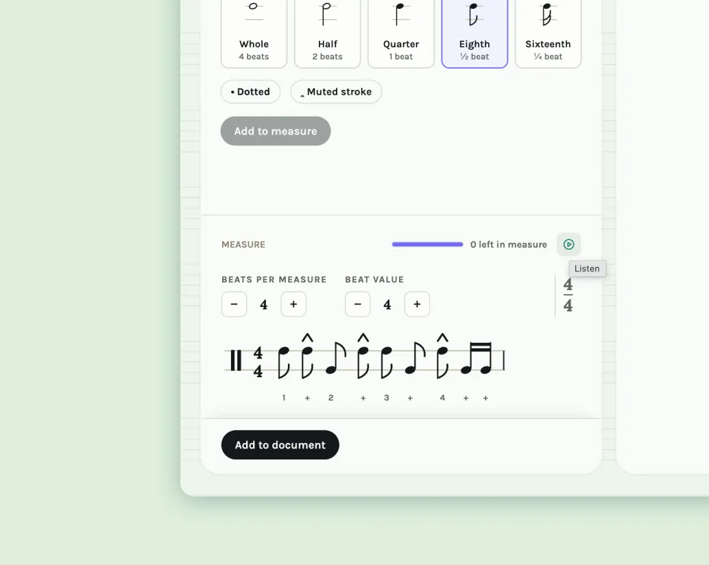
Here’s what I want to be really clear about: the AI did not get smarter between these two screens. Same model. The difference is that in the second round, I did the deciding like what matters, what to bury, what to lead with, what the correct notation actually is, what the sequence of the interaction should feel like, not just what it contains.
The part people miss
Let me head off one misreading. Design B is not the output of “one better prompt.” I didn’t find the magic words.
Design B is the output of roughly two weeks of detailed thinking about flow, hierarchy, and restraint, work that happened to end with me handing a wireframe to a tool for the final render. The tool compressed the last mile. It did nothing for the miles before it.
And notice what this reframes. The gap between A and B was never that A looked bad or A looked fine. The gap was interaction judgment, things like sequence, on ramp, preview, and restraint, plus the basic correctness that the model dropped even with a reference in hand. That’s the stuff AI still can’t originate on its own, because it can’t be derived from a feature list, and apparently can’t be trusted to a spec. It has to be decided, and checked, by someone who’s thought about the human using it.
So no, I don’t think AI is coming for the designer’s job. If anything, it did me a favor. It automated the part I care about least, the rendering, and threw a spotlight on the part that was always the actual work: the judgement.
The prompt gave me a good looking screen with no point of view, and a few things flat out wrong. I had to bring the point of view, and catch the mistakes. You can’t type that in a sentence, and I don’t think that changes anytime soon.
