
Ayşe Doğan
Mar 9, 2026
5 min read
How Art Movements Shaped User Interfaces?
As designers, we often follow trends for inspiration. We browse platforms like Dribbble and Behance, or analyze popular SaaS dashboards to discover new visual approaches. We look at older interfaces, dismiss them as “outdated,” and exclude those styles from our work. We build our designs upon these current trends. However, there is a fundamental question beneath it all:

Where did this visual language come from?
Before digital products existed, designers were already debating the same core principles. Louis Sullivan, a pioneer of modernism, famously stated: “Form follows function.” This principle defines the relationship between purpose and appearance.
Minimalist layouts, grid systems, and functional hierarchies didn’t just emerge spontaneously in the software age; they are a legacy passed down to us. Art movements did more than just produce visual styles; they shaped how designers make decisions. Today, we see these reflections across interfaces everywhere. Let’s look at the most influential movements that shaped our design decision systems.
Bauhaus
Founded in 1919, the Bauhaus was based on a radical idea: art and function were inseparable. Design was not about ornamentation; it was a method of problem-solving. Decorations were rejected, and clarity became the priority.
According to Bauhaus, form must serve a purpose. Every visual decision must have a reason. If a visual element didn’t enhance function, it didn’t belong in the design.
This mindset is very familiar in UI design. A clean design system allows us to build a clear product, helping users perceive information more easily. When we reduce visual clutter, we aren’t just trying to look “modern” we are protecting the user’s focus. When choosing button colors, we aren’t just making an aesthetic choice; we are clarifying the action the user should take.

Swiss style
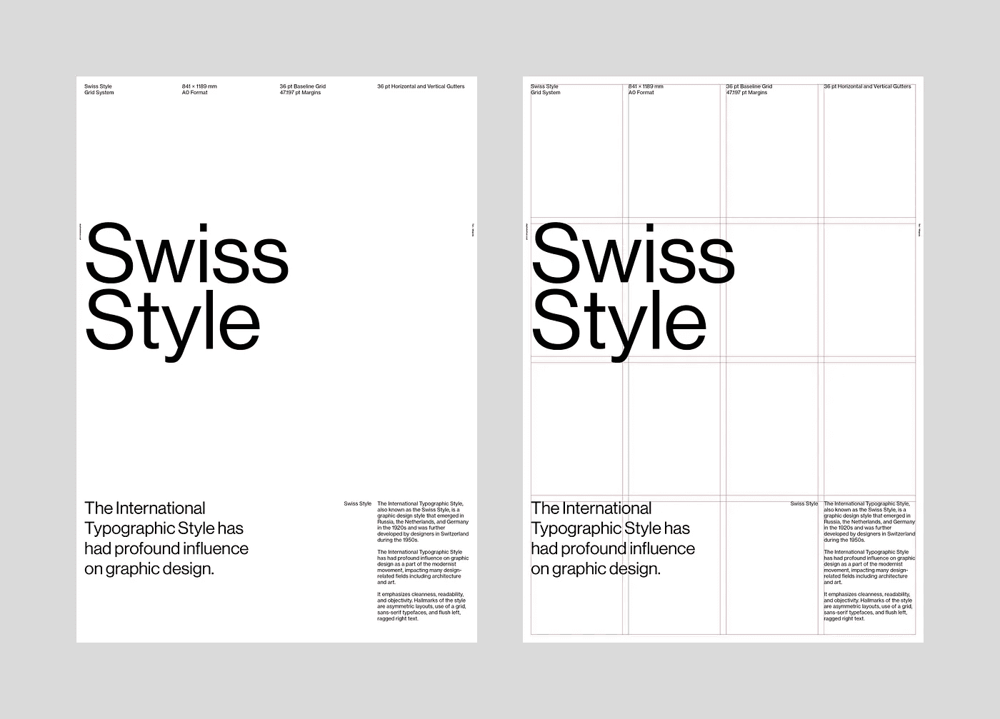
Swiss Style: The anatomy of grid structures and typographic hierarchy.
Emerging in the 1950s, the Swiss Style made modern design more systematic and measurable. This approach introduced rigid grid systems, asymmetric layouts, and an objective approach to typography. As a result, designers began treating their work like architectural structures.
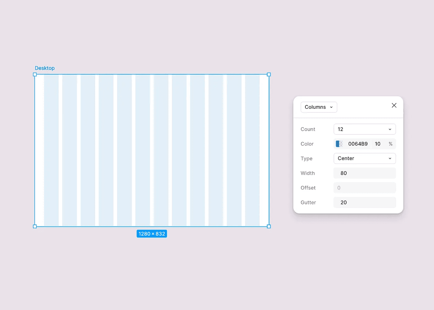
The grid systems used in modern interfaces are a direct continuation of the Swiss Style.
This is the most concrete link between today’s digital design and design history. Almost every digital product today follows a similar structure:
Organized columns
Consistent spacing systems
Typographic hierarchy
Predictable alignments
These didn’t appear by chance; they are the evolution of historically developed systems that reduce chaos, create rhythm, and allow users to scan information faster.
Minimalizm
Minimalism is a concept we have been hearing a lot lately, and we see its influence across many products. We may be at the most extreme point of simplification in product design right now. This year’s Pantone color, Cloud Dancer, an off-white tone very close to white, has already started appearing in designs everywhere. But what was minimalism, really?
The minimalist movement brought a different discipline to design. It did not ask what should be added; it asked what could be removed.
The goal was not to create emptiness. The goal was clarity.
Minimalist artists reduced forms to their most essential state, eliminating every element without a clear purpose. The same thinking appears constantly in modern interfaces.
White space is not just empty space; it creates focus and separation. Using fewer elements does not mean less design; it means clearer decisions. Highlighting a single action is almost always more effective than having multiple actions compete with each other.
Industrial designer Dieter Rams summed up this approach in a single phrase: “Less, but better.”
Today, many modern interfaces operate on the same logic. Landing pages focused on a single primary action, simplified navigation structures, and reduced visual noise are not just stylistic choices; they are the result of a deliberate approach to reduction. But this approach needs to be applied correctly. If the balance between empty and filled space is not handled well under the name of minimalism, the result will be a design where some text on a white page never manages to stand out.

The minimalist approach strengthens focus by removing unnecessary elements.
From Art Movements to Interface Decisions
When we look at modern interfaces, it becomes clear that these movements did not only influence visual language. They also determined how design decisions are made.
Bauhaus taught us to focus on purpose. Swiss Style made structure systematic. Minimalism sharpened clarity.
Taken together, these approaches form the foundation of modern interface design.
Many of the principles we consider “best practices” today are actually continuations of these ideas:
Clear hierarchy comes from function-driven thinking
Grid systems come from structural design thinking
The power of simplicity comes from the reduction approach
These principles feel natural to us today. But they were radical ideas developed long before digital products ever existed.
Designers often look for inspiration in the newest interfaces. But many of the ideas we think of as modern are actually rooted in much older thinking.
Understanding these origins changes how we look at design decisions. Minimalism stops being just a visual style. Functional clarity stops being just a trend.
They are all part of a long design tradition.
Art movements did not influence interface design by coincidence. They shaped how designers think.
And today, every well-structured interface is a continuation of that story.
